

 Learner
Ashok
Learner 7,877
Studio Points


 Studio Master
-
Stone Texture, Forward for your kind assessment.

 Ihor, David and 10 others12 CommentsView more comments
-

Heel goed gedaan, hier en daar een beetje donkerder contrast maakt het af! 👍🏼
- View 1 reply
-
Nice work Ashok, and welcome to AHR Studios. Your placement of stones is done very well. Annemie is right about the texture. More contrast in values will give the surface of the stone more depth.👍
1 -

This 😮💨 very bad
2- View 3 replies
-

Looks good Ashok, I always have difficulty with this type of drawing.
1- View 1 reply
-

great texture
- View more comments
-
-
Module 5 Assignment. 41 of 62 . Forward for your kind assessment.
-
Mooi hoor maar mis een beetje contrast hier en daar 😅
1 -
Hi Ashok
I think the proportions of your drawing are very good. The contrast is pretty weak. It seems like it is all the same shade. Try stretching your values and it will really make your drawing stand out.
A good exercise would be to take a good picture of your drawing now, and then go back and add dark shading and bright highlights. You can…
1 -

Ashok, Larry is absolutely right 👍
Your proportions are very good, and that’s a strong foundation. But right now most of your values are sitting in a similar range, which is why the drawing feels a bit flat.
Try to push your darkest darks more, especially in the areas where fruits overlap and inside the bowl. At the same time, protect your… Read more
3 -

Yes great proportions and nice smooth shading. Keep it up.
-
wow that is amazing
- View 1 reply
-
-
Module 5 Assignment.
Well Guys this is my biggest challenge, don’t flatter me. tell me how I did. Sir Ali, what do you think?
View more comments-
Nou Ashok, dit heb je heel goed gedaan! 👍🏼
-
Hi Jit
Your cherries and leaves seem to be drawn very well. I think it would be well to darken the cherries, leaves and shadows. This would give stronger values and more contrast.
I did the cherry exercise and I used a “Primo Elite Grande Organic Black #5000” to darken them an it seemed to do well and made them really stand out. Below is a picture of them.
4- View 1 reply
-
Good proportions in the drawing. Yes I think Larry is right. Using some darker values will really make the shiny light portions pop.
-
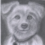
Thanks Guys for your kind input, it was well received.
-
Hi Ashok 😊
I like that you’re pushing yourself here, and overall this is a strong attempt.
What’s working well is the form and shine on the cherries. You’ve understood reflections nicely, and the leaf texture is handled with good control.
Now the honest part. Your values need a bit more depth. The darkest darks are not strong enough yet, so… Read more - View more comments
-