


 Learner
rickie
Learner 9,873
Studio Points


 Studio Master
-
the genie lamp I have trouble blending don’t feel as though it is enough but all in all not to bad lol
 HUSSAIN, Akanksha and 8 others6 Comments
-

Nou Rickie ik vind dat je lamp er heel goed uit ziet hoor! 👍🏼
- View 1 reply
-

Very nice Rickie. You might try smoothing the dark areas with a stump or tissue.
1 -

thanks Larry i did use stump and tissue maybe more effort needed lol 👍
-

Rickie, this is looking great! Since you have already tried a stump and tissue, you could build the darker areas up gradually with several light layers. That will give you a smoother blend while keeping the form clear.
- View 1 reply
-
-
nice sunday morning apple and bannana
-
Ja ziet er heel goed uit Rickie👍🏼
1 -
Ziet er heel goed uit Rickie👍🏼
1 -

Looks good!
1- View 1 reply
-
Hi Rickie
Your apple and banana look very well proportioned. I feel there could be a little more contrast in values.
I especially like your white socks!
- View 1 reply
-
-
a little darker
-
Duidelijk veel beter nu 👌🏼
1 -
Hi Rickie, that makes quite a difference. If you go a step further and show where the light source is located, it will make another strong improvement. Show the sun lit side of the building, the shaded side and the cast shadows. Give your drawing some bold contrast in shading.😊
-
Rickie, this is a big improvement. Now try to make the light source clearer. Choose one direction for the light, keep the sunlit side of the building lighter, deepen the shaded side, and add the cast shadow. That stronger contrast will give the perspective more depth and make the forms feel more solid.
-
-
banana’s enjoyed this one actually found the free hand a little scary
-
Heel goed Rickie, de banaan lijkt los te komen van het papier 👍🏼
- View 1 reply
-
Rickie, you did a great job with this banana. It really does look like it is lifting away from the paper, as Annemie noticed. The dark underside and softer shading across the middle are giving it a lovely rounded form. Next time, try keeping the outer contour very light until the values are established. That can make the freehand process feel… Read more
- View 1 reply
-

Nice drawing Rickie 👍
- View 1 reply
-
-
2 point perspective any comment humbly received
-
Rickie, nice work! One thing that stands out – your vertical building lines are staying vertical, which is exactly right in two-point perspective. If you want to push it further, keep an eye on making sure all your receding horizontal lines aim cleanly at those two vanishing points. Locking those in will make the whole scene feel more solid.
1- View 1 reply
-
Hi Rickie
Your 2point perspective really looks good. A little more contrast in values would help the drawing stand out more prominently.
Darken things a bit and then make a before and after post. We can all learn from that.😊
1- View 1 reply
-
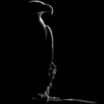
Great start. I choose my vanishing point outside my frame to make it appear more within ratio. If your vanishing points are in the frame, the distance has be great enough to justify. You’ve done very good following the plane though..
2- View 1 reply
-
-
1 point perspective not bad not great but fun
-

@rickiebirt Point perspective drawing can be somewhat boring and not fun to do….but when you go into landscape drawing or sketching, it’s very valuable for example. Understanding the basics. Great drawing and keep faith in the process. 😉
1 -
Hi Rickie
Very well done. Perspectives are very valuable in drawing and often make or break a drawing.
1 -
Rickie, this is a great start! One point perspective is all about practice, and you’ve done a nice job keeping the buildings aligned toward the vanishing point. That’s the most important part. As you continue, try to make the vertical lines a little straighter and clean up some of the perspective lines. That will make the drawing feel even… Read more
- View 1 reply
-
thanks for all your comments
-
-
glass of water
done on plaster picture frame why its grainy
-
Rickie, the graininess is most likely coming from the surface you’re drawing on rather than your technique.
Plaster picture frames usually have a much rougher texture than drawing paper, so the graphite sits on the high spots and creates that grainy appearance. That’s actually quite normal. Even with the texture, the glass is still… Read more- View 1 reply
-

I started using Bristol smooth surface not so long ago, made a huge difference
-
-
thought i would have a go at something differant back ground pitt pastle pencil
-
Whow Rickie, dat is uitpakken zeg, de olifant ziet er geweldig uit!👊🏼
- View 1 reply
-
Rickie, I love seeing you experiment with something different.
The elephant is reading very clearly, and adding the background was a great choice because it helps create a sense of environment and depth. Every time you step outside your comfort zone, you learn something new, and this is a good example of that. Keep exploring and having fun… Read more1- View 1 reply
-

Wow… I love it ill Never try on Color is it very different between Color and Graphit?
- View 1 reply
-
That looks super great Rickie.
- View 1 reply
-
-
just the beginning for me
these are some of the drawings i have done comments appreciated . please remember i have just started the course so i am convinced these pictures can only get better .thanks
View more comments-

Nice 👍
1- View 1 reply
-

Welcome. That is a great start. Keep it up. I just started drawing myself. I’m sure you will enjoy your journey here!
1- View 1 reply
-
Ik vind je zelfportret er heel goed uitzien!
1- View 1 reply
-
Hi Rickie
Those are very good drawings, especially for just starting. I am a retired building contractor and I started learning to draw about 6 months ago. I am amazed at how fast I have learned to use the tools and supplies needed to produce drawings I am proud of.
Ali has created and provided excellent progressive instructions on how to…
1- View 1 reply
-
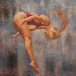
These are very good starting drawings, Rickie. You already have a nice sense of form and observation, especially for someone who has just begun the course. The little dog is definitely my favorite, it has a lot of character and charm. Keep practicing! 👍
1- View 1 reply
- View more comments
-

