


 Learner
Martin
Learner 4,705
Studio Points


 Studio Master
-
I drew my pet 🫨 it was hard
 Cheryl, Hristo and 4 others40 CommentsView more comments
-

Would love to draw like this. Amazing work

 2
- View 3 replies
-

This looks amazing! Thank you for sharing .
- View 1 reply
-

Great work, Martin!
1- View 1 reply
-

very good martin you got it all light mid and dark tone very impressive
1 -

Thank you very much rickie I spent a long time studying my reference photo 😂
1 - View more comments
-
-
Magic
@alihaiderrehman How can I get my 8B pencil as black as the master’s in all of his videos? My 8B pencil, also from Faber-Castell, is dark, but it looks more dark grey rather than black. Can anyone answer this for me?
Best regards!
-

I think paper makes a huge difference, and also layering instead of pressing hard which can damage paper tooth
1 -
I believe there is only so much you could do with pencils, charcoal is the next game, most of the images we see are online and colour differences makes it appear darker than it actually is. Just my observation, although you could gently keep applying layers and smudge them gently after each layer until you get as close as you could. But that…
1 -

I just did the skill test. Drawing the eye. I found that using 2B then layering over that with the 8B made the pupil really dark
2 -
Thanks for your comments and tips 💪
-

For a deeper black with an 8B pencil, I would suggest using a smooth paper that still has enough tooth to hold several layers. Very smooth paper can give you a clean finish, but it may not hold much graphite. A medium-smooth drawing paper is usually a good balance.
Start with a softer, medium-dark pencil such as a 2B or 4B and build the… Read more
2- View 1 reply
-
-
My 1000 Years old Girlfriend
-

Whow Martin, curieus maar góed! 😱
1- View 1 reply
-

Very impressive Martin. This is definitely not what I would want to wake up to in the morning.
 1
- View 1 reply
-
Martin, this is really impressive! It’s definitely a little unsettling, but that’s exactly why it works so well. You’ve handled the colored-pencil detail and contrast beautifully, and created something that really grabs your attention 😅
-
-
Proportion a Bit Off but its ok 😌
-
Hi Martin, this is very nice. Is it from a tutorial?
- View 1 reply
-
very gothic but good as well nice work
1- View 1 reply
-
Martin, this atmosphere is incredible. Those light beams cutting through the darkness and the sheer scale of those arches give the whole piece a powerful, almost haunting mood. I felt myself pulled into the space immediately. Beautiful work.
2- View 1 reply
-

Wow 😍 so cool! Love the vibe and the detail is incredible!
1- View 1 reply
-

Beautiful drawing. I like that you are applying what you’ve learned in drawing lessons and drawing what you enjoy!
- View 1 reply
-
-
Dragonfly Missed
I don’t really like this drawing because I wasn’t sure how to draw the dragonfly so that it would look realistic. It would have needed a lot more fine details, but I wasn’t exactly sure how to add them. How would you have drawn something like this?
Best regards,
-
Hi Martin, I usually use a reference image, better digital for zooming in purpose, and I study shades and gradients each part at a time…. I am not very good with drawing from imagination!!!
2- View 2 replies
-
Martin, first of all, don’t be too hard on yourself. I actually think you’ve done a great job overall. Looking at the reference, the dragonfly itself doesn’t need a lot more detail. The biggest difference is actually the contrast. In the reference, the dragonfly is much darker in certain areas, which helps separate the body and wings from… Read more
2- View 2 replies
-
-
Love with one eye
-
These surrealist works are very inspiring; I love them. Congratulations 👏🏻👏🏻🤩
- View 1 reply
-
Now that’s what I call an eye catching drawing! 👏 very well-doneeeeeeee!
2- View 1 reply
-

Really funny, I like it.
1- View 1 reply
-
I absolutely love this concept. It’s so creative and surreal, yet it still feels elegant rather than shocking. The composition immediately grabs your attention, and that single eye becomes an incredibly powerful focal point. The smooth shading on the face contrasts beautifully with the torn opening around the eye, making the illusion even… Read more
1- View 1 reply
-
-
Come to the Dark Side
View more comments-
Heel goed gedaan hoor maar ook heel eng brr
1- View 1 reply
-
Super good Martin.👍😊
1- View 1 reply
-

Hahahahah huge…….like that style.
1- View 1 reply
-

love it
1- View 1 reply
-

A little bit creepy……😂….but drawing superb.
1- View 1 reply
- View more comments
-
-
Struggle
There are still so many things I need to improve… What does hyper-realistic actually mean? Is my drawing heading in the right direction? What else do I need to improve to make it look truly realistic? I appreciate every piece of criticism. Thank you.
View more comments-
Hi Martin
Is this one of Ali’s exercises? I f so, I would say watch the exercise again and see what you might have missed. I think your drawing is very good but could use some detailed refinement. When I watch Ali’s exercises I try to copy every stroke he makes, and listen intently to every word he speaks. Sometimes I watch the exercise over…
1- View 1 reply
-
Ja Larry heeft gelijk je tekening is goed maar mist de afwerking Martin!
1- View 1 reply
-
Really good martin 😍
- View 1 reply
-
This is such a striking and imaginative piece.
What especially caught my attention is the cracked texture on the shoulder and the palette-knife-like marks. I actually zoomed in to study them and try to figure out how you created those effects.
The composition, the dramatic lighting, and those haunting eyes all work beautifully together. 👏
1- View 3 replies
-

Hi Martin
I haven’t read the other comments so maybe I’m telling you something you already know. Sorry.
Hyper realism is when the contrast is very high in the details of the drawing. For example: add more darkness to the lips on your drawing underneath the white areas. Then add some (skin)lines above the white part of the lip.
If you have done…
1- View 1 reply
- View more comments
-
-
T1000 💪
-
Wow. Excellent job. You did an incredible job with the metal parts on the terminator! Truly looks like metal. Keep up the creativity!
2- View 2 replies
-
Nice work Martin. This really looks good. My guess is that you spent a lot of time on this drawing.😊👍
2- View 1 reply
-
🤩Really very nicely done and great 💡
2- View 1 reply
-

Good work
1- View 1 reply
-
good job i like that !!
1- View 1 reply
-
-
My neighbor from transilvania
View more comments-
👍 Nice job so far
1- View 1 reply
-
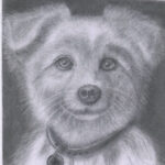
This is very Good Martin.
1- View 1 reply
-
Hi Martin
You have scary neighbors.
1 -
Goed gedaan maar zou haar niét willen als buur haha!😝
1- View 1 reply
-
I think the skin tone looks very nice.
And the facial features do look nice. Some balances shading would make it look better. But overall, we understood the neighbor
2- View 1 reply
- View more comments
-
- Load More
