
 Supporter ♥︎
Vyshnav
Supporter ♥︎ 2,371
Studio Points


 Art Virtuoso
-
Hi
Hi 👋 sir, actually i did it with eraser instead of white pastel pencil which was seen in tutorials, but i cant use pastel pencils like tutorial I don’t know why, i also tired in strathmore bristol paper too with variety pressure.

 Cheryl, Ihor and 10 others11 CommentsView more comments
-

Loved it👌
1- View 2 replies
-
𝔾𝕠𝕠𝕕
- View 1 reply
-

Heel mooi gedaan vyshnav!👍🏼
1- View 1 reply
-

Vyshnav, this came out really well. Your highlights read clean and the values hold together nicely, and you got there with an eraser instead of following the tutorial exactly. That is not a mistake, that is problem solving, and it is a good sign in a student.
On the pastel pencil, I think I know what is happening. Strathmore Bristol is a… Read more
1- View 1 reply
-
❤️
- View more comments
-
-
My latest drawing
I messed up a little😅
View more comments-
What a beautiful nose and mouth, I love it! 🫠
3- View 1 reply
-

Looks Fantastic well done!!!
3- View 1 reply
-
Verpest? Ik wou dat ik het zo zou kunnen!
👍🤩
2- View 1 reply
-
- View 1 reply
-
Mijn laatste gemaakte opdracht!🙂
4- View 1 reply
- View more comments
-
-
-

like it, well done.
2- View 1 reply
-

Excellent
2- View 1 reply
-
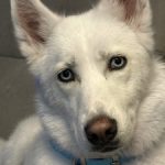
You did a great job on this
2 -
Vishnu, you really love drawing characters and it shows 😊
I loved your Jack Sparrow drawing, and now this Wolverine is so cool 🔥
One small suggestion to push it even further. Try adding the lightest highlights and the darkest tones. That full value range will enhance the drawing even more 👍2- View 1 reply
-
-
Captain Jack sparrow
Kindly share your suggestions , mt camera is not that good and it failed to capture depth in it
-
Ahh Jack Sparrow!!!!!!!!!!!!!! one of my favorites too 😄
And honestly, even with the camera quality, your drawing looks amazing. The character and likeness are clearly there. Great job, Vyshnav…………….2- View 1 reply
-
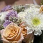
Absolutely beautiful
2- View 1 reply
-
This is so good!
-
-
-
Really nice work, Vyshnav 👍
This is a cute drawing and you’re doing well. Keep going 😊2- View 1 reply
-

Nice one
2- View 1 reply
-
-
When I start shading the face is not same,how can I fix this
-
Hi Vyshnav 😊 nice progress so far. The face shading looks different mainly because the mid tones are missing and the jump from light to dark is happening too quickly. Try blocking the entire face first with one soft mid tone, then slowly build the darker shadows on top instead of pushing them early. Keep the highlights clean and untouched…
- View 1 reply
-
-
Trying portrait
-
This looks awesome Vyshnav. You really captured the intensity in his expression and the hair work is especially good. Keep practicing your midtones and soft transitions and your portraits will level up even faster. Great effort, keep going 😊🔥
- View 1 reply
-
-
Hows it guyz, I can't draw fur properly
-
Hey Vyshnav, don’t worry at all, this is completely normal when you’re just starting out. Fur is honestly one of the trickiest textures for beginners, so you’re doing totally fine. Keep practicing and you’ll see a big difference very soon.
For a proper breakthrough, try watching Module 6 Lesson 3 inside the course. That lesson covers the full… Read more1
-
-
Hows it guyz
Any suggestions or tips 😅
-
These look great Vyshnav! 🍐 The texture and shape are really well done you’ve captured that smooth pear skin beautifully. If you want to push it a little further, try deepening the shadows under the pears and darkening the cast shadow on the table. It’ll make them pop off the page even more. Overall, lovely work they already look tasty! 😄
1- View 1 reply
-