



Studio Community
Welcome to AHR Studios Community.
Group Rules: Please do not post random text, unrelated content,... View more
Organizer:
- Organized by
-
-
Group Feed
-

Ryan posted an update in the group
 Studio Community 3 months ago
Quick question
I’m going to be honest I haven’t started the course yet because I am currently going through an art book but when I do go through the course I want to record my drawings and post them on social media. My question is, if I record the entire process of my drawing and post it for example on Patreon and make money from the recording of my…
Akanksha, David and 2 others5 Comments-

I would say if you want to make money for it you would need the original author permission and you will need to post a link to the original video. But I suggest you learn the skill from the course, develop your own style, and make your own.
The reference would be copyrighted and the method developed by Ali, you cannot just use it as your own
-

i agree with Cheryl
1 -
I think @cheryl is right about the matter.
-

Thank you for the input guys
-

Hey Ryan. The drawings you create are yours. You own your artwork, no question. But the reference images and the specific teaching method in the tutorials are Academy content, so monetizing videos where you are essentially reproducing the tutorial step by step would need permission and proper attribution.
Cheryl put it really well. Learn… Read more1
-
-
Mehmet posted an update in the group
Studio Community 3 months agoDear Ali, getting your opinion before moving forward is very valuable to me. The bubbles turned out to be a bit harder than I expected, and I wasn’t sure if I was doing them correctly 🤔😅
-

That looks really good so far!
1 -
i like it may be needs softening a bit so it blends in . but hay i am still learning may self so don’t take that as gospel lol
-
Hey Mehmet, the bubbles are coming along. The main thing to watch is the highlight direction. Keep that bright spot facing the same way on each bubble so they all look like they are catching the same light. The ones where you have done this already are reading as properly round and three dimensional.
rickie made a fair point about… Read more
- View 3 replies
-
-

Cheryl 🜲 posted an update in the group
Studio Community 3 months agochilli again
Trying this again with my new pencils and paper, I’m not sure if it produce much better results proportional to the price difference but definitely a lot nicer to use and blends a lot easier. A lot less effort and strain on my wrist to put colors on.
I didn’t follow the tutorial this time, it could probably use some darker shades in…

-

Wow! What a difference. Your new pepper looks so rich and vibrant. 🎶. What pencils did you use this time?
 1
- View 1 reply
-
thats amazing!
1 -
I guess the polychromos. Very nice pepper. Tasty looking. @cheryl
👏
2 -
Hey Cheryl, this is a really useful side by side. You can clearly see how much richer and smoother the new one looks.
You are absolutely right about the materials making a difference. Better paper and Polychromos really do blend more smoothly and take less effort to lay down. Your wrist will thank you.
And yes, pushing some darker shades in… Read more
1
-
-
Frederic 🜲 posted an update in the group
Studio Community 3 months agoMy own interpretation of assignment 28.
I spent yesterday afternoon and most of the night pushing the contrast a bit further. Here’s the result. I hope you like it! As always, I’d love to hear your thoughts and feedback.
-
I’m not very good at giving feedback but they both look great. It does look better with higher contrast
1 -

Your lines are so clean and flawless that one can’t find a single thing to criticize. It’s impossible not to admire your work 👏🏻👏🏻
1 -
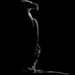
What are those round effects on the sketch area, I don’t see it on the plain area,,,
- View 1 reply
-
i don’t know i like both really good grapes on first look so real and also on second one brilliant i would be happy if i could do that what can you say perfect both drawings
1
-
-

Mayur posted an update in the group
Studio Community 3 months agoMy 1st sketch towards the journey
Starting my journey
-
Hi Mayur, welcome to AHR Studio community. That is a very nice looking eye. I’m guessing that you will really enjoy the journey your about to engage.
- View 1 reply
-
wow! you did so good on your first try!!!
-
good luck on your journey and a very good start and welcome cant wait to see your future drawings
-
Welcome to the community, Mayur. This is a strong eye study to start with, and the community here is incredibly supportive, so keep posting your progress. Looking forward to seeing where your journey takes you.
-
-
Frederic 🜲 posted an update in the group
Studio Community 3 months ago3 months ago (edited)
My own interpretation of assignment 28.
My last drawing before heading to the hospital on Friday. As I mentioned earlier, I wanted to create a drawing based on a reference photo, and it was @fjienarta who inspired me with the idea for this final drawing. So here it is!
Although there’s always room for improvement. I suppose @alihaiderrehman will tell me that I could have pushed…
View more comments-
very nice. Looks like a real black and white photo!
1- View 2 replies
-
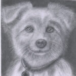
Yes, as Cheryl said like a real B and W photo.
1 -
It’s so realistic
1 -
Very well done Frederic. I think you are right about what Ali would say regarding pushing the darker values a little further.
I am looking forward to you being back on line soon.
1 -

Your drawing is really very good, it’s look like real picture and thx @pacific8118 if I can be inspired for your drawing. I am also very happy to be a part of this community. The Instructur @alihaiderrehman and All Members are very helpful to each other, which make me more spirit to practice drawing.
🙏💪👏
2 - View more comments
-
-
Cheryl 🜲 posted an update in the group
Studio Community 3 months ago3 months ago (edited)
Wine Glass
I almost gave up on this. I didn’t have a good start, but I think it turned out ok.
I didn’t use a grid and the glass is a lot wider than the reference.
Used Faber Castell Black Edition pencils + gelly roll
-
@cheryl You still amaze me with your ideas and drawings. 👏
1- View 1 reply
-
Lovely,I like it.
1 -
This is fantastic Cheryl. Is this a AHR tutorial?
1- View 1 reply
-
wow very nice drawing Cheryl 👏
1 -
very very very gooood
1
-
-

Ali posted an update in the group
Studio Community 3 months ago🆕 Real-Time Tutorial Now Available!
This easy Cute Baby Drawing is now available in the Graphite Pencil Tutorial Library → Intermediate section, and it’s also shared in the Studio Feed so everyone can find it easily.
View more comments-
@alihaiderrehman this one will be for after my recovery. 😉
2 -
Nice
-
stunning!!
-
Ali ( I think you could push the darker values a bit more lol )
I will give this a go when i get to this stage. nice cute pic
 1
-

Beautiful
1 - View more comments
-
-
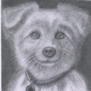
Ashok posted an update in the group
Studio Community 3 months agoEagle
I am building confidence.
-
Hi Ashok, your eagle really looks great. I think a little more contrast in values would be striking.👍
1- View 1 reply
-
Ashok, you certainly are building confidence, and it shows! 😊
This is a beautiful study. I really like the feather texture around the eye, and you’ve done a nice job capturing the sharpness and intensity of the eagle’s gaze. One small suggestion would be to push the darkest values a little more around the eye and beak to create even… Read more -
Hi @Jit I agree with larry. A little bit more contrast and it would be perfect IMHO.👍
-
That’s my weak point, the contrast. I’m working on it. Thanks all. all credit goes to my instructor, respectfully Ali.
-
-
Mehmet posted an update in the group
Studio Community 3 months agoI am really curious to see how it turns out. I am open to your suggestions. Have a good day, everyone. 😊😊
-
Hi Mehmet
Looks like a very good start.
- View 1 reply
-
Mehmet, I really like where this is heading! 😊 Even at this stage, I can already see a nice sense of depth and atmosphere. The eye immediately draws my attention, and the soft shading gives the portrait a calm, realistic feel.
As you continue, I’d focus on increasing the contrast little by little. Let the darkest shadows become a bit richer,… Read more- View 1 reply
-
@Burcik I think you gone nail it. 😉
- View 1 reply
-
- Load More