


Studio Community
Welcome to AHR Studios Community.
Group Rules: Please do not post random text, unrelated content,... View more
Organizer:
- Organized by
-
-
Group Feed
-
larry 🜲 posted an update in the group
 Studio Community 3 months ago
3 months ago (edited)
Walking Stick-revision
Ali gave me somegood advise on my walking stick drawing. He suggested i push the darkest values a little more in the shadows between the body segments and around the legs.
I did this and it certainly made quite a difference in the overall look of the drawing. I also darkened the shadows under the legs and body.
The Drawing on the left is the revised version.

 Anim, Akanksha and 12 others6 Comments
-
Larry, you’ve really transformed the contrast in your drawing—I absolutely love it. Your animal drawings are incredibly realistic 😊🙏
- View 1 reply
-

Larry, this is exactly why I always encourage making small adjustments instead of changing everything at once. 😊
The revision has made a noticeable difference. Those darker shadows give the insect much more depth and help separate the body segments beautifully. It’s a great example of how a small value change can completely transform a… Read more- View 1 reply
-
HI @larry , I wrote before that It’s fascinating to see how something so tiny reveals such intricate textures when scaled up. Even more now. I’m a great fan of yours. 👏
- View 1 reply
-
-
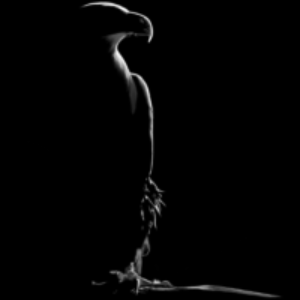
Abbasi 🜲 posted an update in the group
Studio Community 3 months agoUntitled
Scribbled more than the reference image.
I have began to like naming my sketches. This one is still at struggle.
-
Abbasi, I really like this concept. 😊 The flowing lines create a unique texture and give the piece a strong artistic style. Sometimes adding more than the reference is what makes a drawing your own. Keep experimenting. I think you’re developing a really interesting style.
1
-
-

Filip posted an update in the group
Studio Community 3 months agoI’m having trouble achieving deep black when shading. Every time when I press harder, I end up with a dark gray that starts to shine instead of looking black.I’m using Faber-Castell 4B, 6B, and 8B pencils (8B is the softest pencil in my set). I also have a Pitt Graphite Pure 9B.Does anyone have any tips on how to get deeper, richer blacks…
-
Hi Filip
I have used “ Primo Elite Grande- organic black #5000” on items that I wanted really black and it worked well for me. I am very happy with the results.
Attached is a drawing from the cherries tutorial that I used this pencil to darken the cherries.
4 -

I find Staedtler Black Lumograph 100B quite dark, the 8b is quite a lot darker than faber castell 12b, and it’s less shiny
1 -
I personnaly use Faber-Castell 115207 – Pitt Graphite Matt. Doesn’t give that shining reflexion.
1 -

Thank you everyone for the advice! That was exactly my problem. I recently started Final Portrait Drawing (1), and when shading the hood, I just couldn’t achieve that deep black using my 6B and 8B pencils. Then I tried pressing harder with the 8B, but everything started to get shiny, and it didn’t look very good.
- View 1 reply
-
One more thing that really helped me was changing the way I see black. Instead of trying to make one area as black as possible, I focus on the overall contrast of the drawing. Very often, once the mid tones and surrounding shadows are developed, the same dark area suddenly appears much darker without adding any extra graphite.
It’s all… Read more
1
-
-
Frederic 🜲 posted an update in the group
Studio Community 3 months agoOnly a couple of days left before I head to the hospital, but there’s one last drawing coming in the next few days. Thanks as well to everyone who wished me good luck—I truly appreciate your kind words.
View more comments-
Be well, take care.
1 -
Frederic, we’re all thinking of you and wishing you the very best. ❤️ Take good care of yourself, and don’t worry about the drawings. Your health comes first. We’ll be here when you’re back, and we’ll all be looking forward to seeing your next masterpiece. Wishing you a smooth surgery and a speedy recovery. 😊
1 -
I hope you have a speedy recovery. Please don’t leave us worrying—remember, you have a huge family here, too. All our prayers are with you 😊😊🙏
1 -

take care Frederic, get well soon🙏
1 -
I hope you feel better.
1 - View more comments
-
-

Frenky posted an update in the group
Studio Community 3 months ago3 months ago (edited)
Assignment 28
Practice Using Grid Technique Drawing Apple & Banana
I try to take photo from different angles to make my drawing look more realistic 😃
-
Frenky, you’re making great progress! The proportions look much more accurate, and the shading is becoming smoother with every assignment. I also like that you’re experimenting with different camera angles. It’s a nice way to present your work and see it from a fresh perspective. One small tip would be to push the darkest values a little… Read more
1- View 3 replies
-
@fjienarta well done! Great drawing. You’ve given me an idea before I head to the hospital. I was busy with the fried egg drawing, but I’ll try a similar setup based on a reference photo. I only have a few days left. You’re getting better and better. I hardly recognize your work compared to your first drawings👏
1- View 1 reply
-
Lovely, keep going.
- View 1 reply
-
-

Cheryl 🜲 posted an update in the group
Studio Community 3 months agoApple
Followed a tutorial but not too happy with it 😂 Not being too hard on myself. But I like criticizing my work so I can improve in future.
There a lot of empty spaces if you zoom in. I think it’s because I didn’t use a brush or tissue. The tutorial was using prismacolor and didn’t do it. It could also be paper issue. I was only using normal…
-
@cheryl Don’t be so hard on yourself. I find it very well done and tasty 😋. The colors are not off in my opinion. A great looking apple. 👏
1 -
Hi Cheryl
Your apple looks delicious. Your analysis of your drawing is probably very accurate. I think a smoother paper and a little brushing would make the colors glow and smooth them out a bit also. Well done.
You might try A paper called Legion Stonehenge White, 120 lb, 320 gsm. It should give you very smooth results, and it accepts layering…
1- View 3 replies
-
Cheryl, I actually think this turned out really well! The overall form is solid, the highlights are nicely placed, and the colors make the apple feel vibrant and fresh. I don’t think the empty spots are a big issue. A lot of that can come from the paper texture, especially when using a sketchbook paper that’s not designed for colored pencils.… Read more
1
-
-

rickie posted an update in the group
Studio Community 3 months ago1 point perspective not bad not great but fun
-
@rickiebirt Point perspective drawing can be somewhat boring and not fun to do….but when you go into landscape drawing or sketching, it’s very valuable for example. Understanding the basics. Great drawing and keep faith in the process. 😉
1 -
Hi Rickie
Very well done. Perspectives are very valuable in drawing and often make or break a drawing.
1 -
Rickie, this is a great start! One point perspective is all about practice, and you’ve done a nice job keeping the buildings aligned toward the vanishing point. That’s the most important part. As you continue, try to make the vertical lines a little straighter and clean up some of the perspective lines. That will make the drawing feel even… Read more
- View 1 reply
-

thanks for all your comments
-
-
Filip posted an update in the group
Studio Community 3 months agoMy first attempts at drawing with pencils and learning how to sketch. My first lessons and my first mistakes, mistakes I can learn from.
While drawing the cherries, I noticed that I was pressing the pencil too hard, which made it difficult to create the final highlights with an eraser pencil 🙁
Even so, I’m starting to feel a bit more confident.…
-
They look really good for someone who has only started 3-4 days ago!
1 -
As Cheryl said, impressive. Give you time. It’s a learning process. Everyday again and again………👍
2 -
Hi Filip
Your drawings look very very good for just starting. Listen to Frederic; “Every day again and again”.😊
1 -

Really good for someone who just started! Keep it up.
1 -
Filip, first of all, welcome to the community! 😊 It’s great to have you here. Honestly, for someone who only started drawing 3 to 4 days ago, this is very impressive. You should be proud of yourself. I can already see that you’re observing your own work carefully, and that’s one of the fastest ways to improve. You also identified exactly… Read more
1- View 2 replies
-
-
larry 🜲 posted an update in the group
Studio Community 3 months agoWalking stick
This is a drawing of a “Southern Double Striped Walking Stick”. I found one on my patio and took a few pictures of it, then enlarged the pictures and drew 1” grid over it and used it as my referance.
The body of the walking stick was 2” long and the body length in the drawing is 16” long. The paper I drew on is 18”x24”.
View more comments-
This is fantastic! Insects are such fascinating subjects because of all the incredible textures and tiny details, and you’ve captured them beautifully. Enlarging such a small creature into a large drawing really lets you appreciate how amazing nature is. I actually painted a wasp spider not long ago, and working on all those intricate… Read more
- View 2 replies
-
nice details!
- View 1 reply
-
Nice
-
nice drawing Larry 👏
1- View 1 reply
-
You must have had incredible patience! Enlarging a 2-inch insect into a 16-inch drawing using the grid method is no small task. The amount of detail you’ve captured in the body segments, legs, and antennae is remarkable. It’s fascinating to see how something so tiny reveals such intricate textures when scaled up. Beautifully executed—thanks for…
- View 1 reply
- View more comments
-
-
Edit 🜲 posted an update in the group
Studio Community 3 months agoViolin
It was a pleasure to spend some time immersed in this quiet, timeless subject.
-
Very impressive Sedith.🎶
1 -
great love it
1 -

I Like The shading really much . Nice work !
1 -
Edith, this is absolutely beautiful.
I love the calm atmosphere you’ve created. The wood grain, the subtle reflections, and the smooth transitions in value give the violin a wonderful sense of realism. It’s one of those drawings that invites you to stop and look a little longer.
If I could suggest one small thing, I’d add just a touch… Read more -
Hi @SEDITH Edith, I thought I had commented on this masterpiece, but apparently not. So let me do it right away : What a beautiful piece. The soft transitions in the wood grain, the subtle highlights, and the deep, rich blacks create such a peaceful and timeless atmosphere. You really captured the elegance of the violin, and your patience shows…
-
- Load More