

Studio Community
Welcome to AHR Studios Community.
Group Rules: Please do not post random text, unrelated content,... View more
Organizer:
- Organized by
-
-
Group Feed
-
stavik posted an update in the group
 Studio Community 8 months ago
guys pls tell me what to improve on
guys pls pls tell me how to improve, I wanna become the best version of mysel! <span class="atwho-inserted" data-atwho-at-query="@alihaiderrehman“>@alihaiderrehman

 David, larry 🜲 and 8 others9 Comments
-

more tonal range of values will give greater sense of form. less hard outlines will make it more realistic and less comic book style. its really nice. proportions are great and great details. tip of the nose and shape of the mouth are a little weaker than the rest. Hair is super nice and eyes are very impressive
1- View 1 reply
-
Make your outlines less noticeable instead of adding dark strokes and indentations with the pencil. Better tonal values and highlights also help
1- View 1 reply
-

Stavik, I really respect that you’re asking what to improve. That mindset already shows growth.
Your drawing has strong impact and the eye expression is powerful. The water drops are ambitious and that’s great to see. Now to improve further, focus more on value contrast. Push your darkest areas deeper and soften some transitions so the face… Read more
1- View 1 reply
-

👍
1 -
Hi Stavik
Very nice start. If you begin at the beginning of the “Pencil Drawing Masterclass” and dilligently apply your self, you will be amazed at how fast you build your artistic skills
1- View 1 reply
-
-
stavik posted an update in the group
Studio Community 8 months agowhere do i find quizzes?
-
Hoi Staaij, die staan bij de opdrachten!
- View 1 reply
-
-

patricia posted an update in the group
Studio Community 8 months ago
View more comments-
Very nice work Patricia. It looks lik smooth silk.
2- View 1 reply
-
cloth?
2- View 1 reply
-

Nice one.
1- View 1 reply
-
Patricia, this looks beautiful 👏The flow of the lines feels very natural and organic, and your value transitions are much smoother now. I can really see the control in your blending compared to before.
1- View 1 reply
-
Heel goed gedaan Patricia! 👌
1- View 1 reply
- View more comments
-
-

v posted an update in the group
Studio Community 8 months agoreference -AHR youtube vedio
View more comments-

Well Done Looks really good!!
2- View 1 reply
-
Heel mooi gedaan zeg! 👍🏼
2- View 1 reply
-
👍
1- View 1 reply
-
Very nice drawing V. I would like to see the background at the bottom a bit darker. I think that would make the eagle stand out more.👍
2- View 1 reply
-
so much detail
1- View 2 replies
- View more comments
-
-

Ali posted an update in the group
Studio Community 8 months ago🆕 Real-Time Tutorial Now Available!
This easy Soap on Face Portrait drawing is now available in the Graphite Tutorial Library → Advanced section, and it’s also shared in the Studio Feed so everyone can find it easily.
View more comments-
Cant Wait to do this 1!!!
3- View 2 replies
-
Hi Ali
I am anxious to give this a try. I feel it is a bit over my artistic skill level, but my bet is that I will learn a lot.
4- View 2 replies
-
this is gonna be so hard!
2- View 1 reply
-
Hier ga ik me nog niet aan wagen haha
1- View 1 reply
-
Wow!
1 - View more comments
-
-
Annemie posted an update in the group
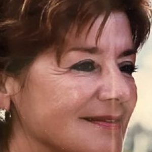
Studio Community 8 months agoLoomis Head
Ik was aan het oefenen met het Loomis hoofd en heb het een beetje verder uitgewerkt ☺️😉
Ik weet dat het bij lange na niet goed genoeg is maar het begin is gemaakt, zónder referentiefoto trouwens.
-
👍
1 -
Hi Annemie
Another very successful exercise. Your drawing looks great.
1 -
NICE!
1 -
Het gaat niet om het eindresultaat 😊 Je hebt geoefend, iets nieuws geleerd en je maakt vooruitgang. Dat is wat echt telt 💪✨
-
Dank jullie wel allemaal!🙏
-
-
anthony posted an update in the group
Studio Community 8 months agomy attempt at this drawing, a bit more complicated than i first thought.Also changed my pencils half way through from mitsubishi hi uni to fc pitt matt. Not sure about the pitt matts at the moment do not seem as dark as the hi uni.
View more comments-
Hai Anthoni, de kersen zijn beide goed gelukt, op de foto aan de rechterkant lijken ze wat mij betreft donkerder!👍🏼☺️
2 -
Looks Good Well Done!!
3 -
looks good.add background to elivate
2 -
Anthony, this is a really strong attempt 👏 The cherries look solid and your reflections are nicely controlled. And yes, you’re right. The Hi Uni usually goes a bit darker and feels smoother in deep shadows, while the Pitt Matt has a slightly different finish and can appear lighter depending on pressure and layering.
If you feel the Pitt Matt… Read more1 -
Bravo
1 - View more comments
-
-
Abbasi 🜲 posted an update in the group
Studio Community 8 months agoCharcoal
Charcoal is really giving me that intensity I needed in my work, ive been ordering a lot of different charcoals sticks and powders and been experimenting, and I really love how th gradient is turning out…. Any advise would be appreciated!!!
-
nicee
-
-
Anastasia posted an update in the group
Studio Community 8 months agoAny tips for right proportions?
Hi everyone! It’s some of my work and I still have big problem with good proportions, I think all of this drawing look little strange with this problem :c Any tips? Have a great and creative day <3
View more comments-
Wow Anastasia
Your drawings look great, even though the proportions are not 100% accurate. Do you use the grid system in laying out the rough outlines for your drawings?
4- View 2 replies
-
bravo c’est super 👍
2 -
Hi Anastasia, first of all your drawings are already really strong your values, shading and details are very well controlled. The “strange” feeling you’re talking about is almost always a proportion issue, and that’s totally normal at this stage.
My biggest advice is to slow down at the beginning and spend more time on the construction… Read more2- View 2 replies
-
that looks very good
1 -
Heel goed Anastasia👍🏼
1 - View more comments
-
-
Erika 🜲 posted an update in the group
Studio Community 8 months agoLittle by little
It’s been a long time since I uploaded anything, the truth is that I felt a little frustrated because I intended to do everything perfect but thanks to the advice of Ali who told me to enjoy the road he made me understand that there are drawings that you can like more or less
I want to take this opportunity to congratulate you all for your works…
View more comments-
En moet je eens kijken hoe goed je bent! Welkom terug 💕
3 -
Hi Erika
Glad to see you are back. Your drawing is beautiful. The fur on the cat looks so real and the butterfly detail is so well done.👍
3 -
Wow well done looks really good!!
2 -
Tellement joli 🤩
2 -
Thank you so much for sharing this, Erika. It honestly means a lot to me that my advice helped you in any way. And your drawing is absolutely beautiful the softness, the fur texture, and the butterfly detail are really well observed. You should be proud of this. The most important thing is exactly what you said: enjoying the process and…
2 - View more comments
-
- Load More