



Studio Community
Welcome to AHR Studios Community.
Group Rules: Please do not post random text, unrelated content,... View more
Organizer:
- Organized by
-
-
Group Feed
-

Frenky posted an update in the group
 Studio Community 2 months ago
Assignment 31
Practice Still Life Drawing: Shape-Based Sketch Without Grids 😃

 Marlon, Ali and 13 others6 Comments
-
Zonder rasters, heel goed!
1- View 1 reply
-

Very well done Frenky.
1- View 1 reply
-

Frenky, this is a great exercise! 😊 You’ve done a really nice job building the objects from simple shapes without relying on a grid. The proportions are looking solid, and the shading gives the objects a good sense of volume. I especially like the way you handled the cast shadows. Keep practicing this kind of shape based sketching. It will… Read more
1- View 1 reply
-
-

v posted an update in the group
Studio Community 2 months agotutorials are not working with points ,i have used very minimal.please need help.
-
v, I know this is annoying when you just want to draw. A small group kept finding ways to exploit the points system, so we decided to close it rather than let it stay broken. The tutorials are still here though – you can grab the ones you want individually or go with a membership for the full library. Both are simple and you can start right… Read more
- View 2 replies
-
-

Akanksha posted an update in the group
Studio Community 2 months agoPractice shades
Please guide me how i have done and what i have to improve 🙌🏻
-
Hi Akanksha
Very nice banana drawing. I especially like the details on the stem.
1- View 1 reply
-
Akanksha, you’ve done a lovely job with the banana shapes, especially the stem details. For your next step, try making the darkest values a little deeper in the areas where the bananas overlap and under the lower edges. That will give the bunch more depth and make the forms feel even more solid.
1- View 1 reply
-
-

Anastasia posted an update in the group
Studio Community 2 months agoHello!
Yesterday, I went back to my very first Walter White portrait. This time, I decided to redraw it without following the tutorial, just to see how much I’ve developed my observation skills and where I am today as an artist. I’d love to hear what you think. 🖤
If you’re just starting out and things don’t turn out the way you hoped, don’t give up on…
-
Great!👌🏼
1 -
Wow! What a difference. You have really developed your artistic skills. This is a great way to see how much you have learned. And by the way you have really done justice to Walter on this drawing.👍😊
1 -

i am guessing the right one is the latest both are good right one seems to me as more professional as i said both are very well done 👏 but then i am just a beginner lol
1 -
Anastasia, what a beautiful way to measure your progress. The first drawing already had a good foundation, but the newer one has much stronger value control, sharper details, and a more confident likeness. You can really see how your observation skills have developed.
Larry said it perfectly, you really did justice to Walter. Keep this… Read more
1
-
-
Abbasi 🜲 posted an update in the group
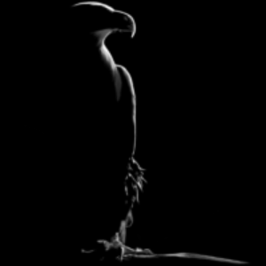
Studio Community 3 months agoCat and light ….
I’ll probably carry this further highlighting around facial features but I quite liked it so far too
-

I love it!! So amazing 🤭
1 -
amazing what a little highlight can do 👏
1
-
-

Cheryl 🜲 posted an update in the group
Studio Community 3 months agoCherry
I think the cherry is not dark enough compared to the reference.
https://academy.ahrstudios.com/reference-packs/dc7/
-
Hoi Cheryl, inderdaad, je kers ziet er heel echt uit maar de kleur is idd wat flets, dat kan zo opgelost worden toch😋
- View 1 reply
-
Wacht even af wat Ali ervan zegt!
1 -
Cheryl, the roundness and form on these cherries is already working nicely, and those stems have a great natural curve. So don’t stress too much about the value match just yet. The structure reads well and that’s the harder part.
If you do want to push the darkness, try layering a dark red or burgundy first, then use black only in the… Read more
2- View 2 replies
-
Hi Cheryl
Very nice cherry. Are you going to draw another cherry and post the two together?- View 1 reply
-
-

Pratik posted an update in the group
Studio Community 3 months agoFirefly
Posting my most recent work.
I forgot to click a picture before framing it 😅 I usually pick an image from Ali’s reference packs but this time I thought of trying an AI tool to get reference image.
@alihaiderrehman Requesting you to please attempt something similar like this and create a video. If one exists then someone please mention the link…
-
Heel mooi gedetailleerde hand!👍🏼
1- View 1 reply
-
Hi Pratic
Your hand is drawn very well, and it looks so real. Your background is very solid with uniform shading, and I like your fire fly.
1- View 1 reply
-
Sorry for the late reply, Patrik! 😊 I’m really glad I finally got to see this. This is such a creative idea, and I love that you experimented with charcoal, graphite, and coloured pencils together. The way you created the glow around the firefly against that dark background works beautifully. And honestly, don’t worry about saying you’re bad… Read more
1
-
-
Annemie posted an update in the group
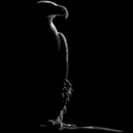
Studio Community 3 months agoHallo Allemaal, ik heb een poging gewaagd met de Adelaar 😌
Ik weet niet of het officieel mag maar ik kreeg de achtergrond alleen zo zwart met een Calligrafeerstift!😬
Aangezien ik mijn werkstukken toch voor mezelf houdt vond ik het geoorloofd om hiermee te experimenteren, wat vinden jullie hiervan?
Graag jullie commentaar, groetjes Annemie
-
Hoi Annemie, die inkt-achtergrond is een sterke keuze – het geeft echt drama en duwt de adelaar naar voren. Een ding dat het nog meer kan tillen: het oog en de snavel hebben al mooie diepte. Als je de donkerste waarden in de nek en de lichaamsveren nog iets dieper zet, komt het grafiet beter uit tegen dat zwart en voelt de hele vorm ronder.… Read more
-
Hi Annemie
Out standing. Beautiful work on this drawing. Your drawings are improving in leaps and bounds.👍
- View 1 reply
-

Very well done! Such nice crisp details!
-

it looks great, the eye really stands out great focus point
- View 1 reply
-

Looks amazing. Well done!
1- View 1 reply
-
-

rickie posted an update in the group
Studio Community 3 months ago2 point perspective any comment humbly received
-
Rickie, nice work! One thing that stands out – your vertical building lines are staying vertical, which is exactly right in two-point perspective. If you want to push it further, keep an eye on making sure all your receding horizontal lines aim cleanly at those two vanishing points. Locking those in will make the whole scene feel more solid.
1- View 1 reply
-
Hi Rickie
Your 2point perspective really looks good. A little more contrast in values would help the drawing stand out more prominently.
Darken things a bit and then make a before and after post. We can all learn from that.😊
1- View 1 reply
-
Great start. I choose my vanishing point outside my frame to make it appear more within ratio. If your vanishing points are in the frame, the distance has be great enough to justify. You’ve done very good following the plane though..
2- View 1 reply
-
-

Martin posted an update in the group
Studio Community 3 months agoProportion a Bit Off but its ok 😌
-
Hi Martin, this is very nice. Is it from a tutorial?
- View 1 reply
-
very gothic but good as well nice work
1- View 1 reply
-
Martin, this atmosphere is incredible. Those light beams cutting through the darkness and the sheer scale of those arches give the whole piece a powerful, almost haunting mood. I felt myself pulled into the space immediately. Beautiful work.
2- View 1 reply
-

Wow 😍 so cool! Love the vibe and the detail is incredible!
1- View 1 reply
-
Beautiful drawing. I like that you are applying what you’ve learned in drawing lessons and drawing what you enjoy!
- View 1 reply
-
- Load More
