

Studio Community
Welcome to AHR Studios Community.
Group Rules: Please do not post random text, unrelated content,... View more
Organizer:
- Organized by
-
-
Group Feed
-

Wilson posted an update in the group
 Studio Community 4 months ago
Does anyone one know if poster board will work as well as chart paper for the drawings where Ali uses larger chart paper? I can’t seem to find chart paper where I live.
Thank you.
v, rickie and 2 others2 Comments-

Wilson, yes, poster board can work, but it depends on the surface. 😊
If the poster board has a smooth, slightly toothy surface, you should be able to draw on it without any major issues. The main thing to avoid is glossy or coated poster boards, as graphite tends to smudge and doesn’t layer very well on them.
To be honest, I’ve drawn… Read more1- View 1 reply
-
-
Mehmet posted an update in the group
Studio Community 4 months agoI hope something good happens in the end ☺️🙏
 View more comments
-

This is looking very promising! I wish mine had turned out this well. 😄
1 -

Agree with Frederic…
1 -

Looking good so far!
1 -

Very good start Mehmet.👍
1 -
Mehmet, with that attitude, something good usually does happen in the end.
The eye is already looking very promising. The eyebrow has nice depth, and the iris is starting to develop some great detail. Just keep focusing on one small section at a time and trust the process.
Remember, most drawings look a little awkward halfway through.… Read more1 - View more comments
-
-
Frederic 🜲 posted an update in the group
Studio Community 4 months agoStreet art musicians.....
I finally completed the outline sketch for my third street musician artwork. I’ve already shared the first two pieces, and today I’d like to share the outline for the third one. Looking forward to bringing it to life in the next stages!
-
Nice work Frederic. Great characters you have brought to life.👍
2 -

Ik vind deze manier van tekenen echt helemaal Top! 👊🏼
3 -
Great drawings.
2 -
Frederic, I love this series concept. 😊
2
-
-
Frederic 🜲 posted an update in the group
Studio Community 4 months agoLittle boat on the shore......
I wanted a change of pace, so I drew this little boat resting on the shore of an island. It’s not my best drawing, but it was a welcome break from more challenging subjects—and especially from the three-point perspective course that’s been driving me crazy lately! 😅
Sometimes it’s nice to step away from difficult exercises and simply enjoy…
View more comments-

You’ve drawn it with a very clean and beautiful technique; it truly looks flawless. 🙏
2 -
Ben jij echt nog met perspectief bezig? Heb je dat nog nodig dan? Dit is toch helemaal te gek 👍🏼😁
2- View 1 reply
-
Aha leuk, ik ben idd van Nederland en ben hier net zoals jij om te leren daar zijn we immers nooit mee klaar toch!
Maar, never the less, je tekent heel aardig! 👍🏼😁
2 -
Hi Frederic
This is an outstanding drawing. The details on the boat and beach are excellent and the perspective view of the entire drawing is perfect.😊
2 -
Wow that looks incredible! Like a black and white photograph.
2 - View more comments
-
-
Frederic 🜲 posted an update in the group
Studio Community 4 months ago4 months ago (edited)
Some time ago...........
Before I discovered AHR, I bought Fun with a Pencil by Andrew Loomis. While flipping through it recently, I came across this early-stage drawing. It brought back a lot of memories, even though it was only a couple of months ago. Looking at it now, it’s interesting to see how much can change in such a short time.😊
-
I love these kind of draws….awesome.
2 -
Those are pretty cool.
2 -
Rhese are so cute, Frederic! 😊
I love the expressions and exaggerated features. ❤️
2
-
-
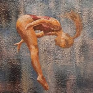
Edit 🜲 posted an update in the group
Studio Community 4 months agoOliver
I’m working on a portrait of my son, and I think I’m about halfway through. Right now, it’s still not a drawing I enjoy looking at… at this stage, all I can see are the mistakes and unfinished parts. But every time I work on it, it improves a little, gaining another layer and another detail. I hope that one day I’ll look back at this stage…
View more comments-
Wonderful Oliver, I love the texture in the Jacket, I can also see details on the shirt. the killer is the ears. very good.
2- View 1 reply
-
Hi Sedith, very nice progress. I understand your feelings at this stage of the drawing.
I am currently drawing a portrait of my daughter. What an experience, i have used every eraser in my arsenal and still not satisfied with the results.
2- View 1 reply
-
@SEDITH What stands out to me most at this stage is how strong the foundation already is. Looking at this stage, I don’t see a portrait struggling with mistakes—And I have to admit, I’m a little jealous of your talent! 😊 The level of observation, patience, and control you’re showing here is impressive, and it’s already shaping up to be a… Read more
1- View 2 replies
-
What a sweet and handsome son you have; you’ve poured all your love into his drawing. Absolutely perfect 🙏😍😍
1- View 1 reply
-
Als je dit halverwege noemt ben je êcht een perfectionist, het is nu al een prachtige tekening gezien de details in zijn kleding en zoals Ashok al zegt, de oren Whow….en het haar enz enz 😅👍🏼
1- View 1 reply
- View more comments
-
-
Abbasi 🜲 posted an update in the group
Studio Community 4 months agoMy first digital
I happen to be drawing a lot more at work. So I was carrying boxes of charcoals and pencils and tools with me all the time. Recently, I decided to give digital art a trial, failed many times but managed to pull something together !!! Its great clean feeling with a lot less weight on the back. And a lot more forgiving with mistakes, layers of…
-

looks nice. I wouldn’t be able to tell it’s digital.
What platform and software did you use?
3- View 2 replies
-
That’s first Class. Allasi.
3
-
-

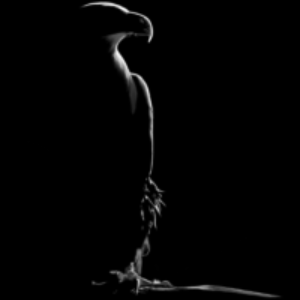
Маrк posted an update in the group
Studio Community 4 months ago
-
Ziet er goed uit Mark, je zou de achtergrond donkerder kunnen maken dan springt de vogel er nog beter uit!👍🏼
1 -
It’s a good drawing, Mark. Keep going and keep enjoying the process. Every piece is helping you build your skills further. 😊👍
1 -

Thanks Ali😍
1
-
-

Cheryl 🜲 posted an update in the group
Studio Community 4 months ago4 months ago (edited)
Quick sketch today
Looks ok on paper but terrible in a photo when zoomed in 😂
I’m not sure how to do the tennis ball texture.
Reference: https://share.google/Jmc6RiVKanm3r0CtJ
-
Hi Cheryl, your tennis balls look great.The texture you gave them looks like real tennis balls. I think if you used a stump on the shadows it would make the texture disappear and make them a smooth shadow.👍
 3
- View 1 reply
-
They look real. Nice job.
2 -
Cheryl, don’t be so hard on yourself.
For a quick sketch, these tennis balls read very clearly, and the shadows are doing a nice job of grounding them on the page. The blending of the shadows is actually a very good idea and helps create a much softer, more realistic look.
Nice exercise, and definitely not “terrible” at all 😉1
-
-

Frenky posted an update in the group
Studio Community 4 months agoAssignment No.13
Practice Shading using Scumbling and stippling Technique
-
Nice going Frenky. Those are really looking good.😊
- View 1 reply
-

👌 wow
1- View 1 reply
-
Nice job. I’m sure you will see the benefits of your hard work soon in an art work that requires these techniques.
2- View 1 reply
-
Frenky, excellent work! 😊
You’re building these textures very patiently, and that’s exactly the goal of this assignment. The value transitions on the spheres are becoming much smoother, and your stippling looks much more controlled than before.
Keep going. Every page like this is strengthening your shading skills for the bigger projects… Read more1- View 1 reply
-
- Load More