


Studio Community
Welcome to AHR Studios Community.
Group Rules: Please do not post random text, unrelated content,... View more
Organizer:
- Organized by
-
-
Group Feed
-

v posted an update in the group
 Studio Community 6 months ago
final project
cristiano ronaldo

 Anim, Ihor and 20 others7 CommentsView more comments
-

Very nice V.
2 -

Looks great!
2 -
Ja goede gelijkenis👍🏼
-

Nice effort 😊
Likeness is there, good start.
Main fix is values. Everything sits in mid tones, so push your darkest areas like hair, eyes, and under the chin.
Also improve structure. Think in planes, not outlines, especially on cheeks and jaw.
Clean a few key edges around eyes and lips.
You’re close. Stronger contrast will lift this a lot… Read more3- View 1 reply
-
Really good 🙏
1 - View more comments
-
-
Abbasi 🜲 posted an update in the group
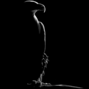
Studio Community 6 months agoBlack paper
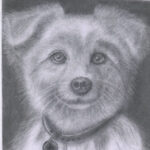
I inspired myself to carry on on black paper
I feel i have to maintiain much work from with chalks/charcoals, water colours, expeirmenting and loving it. Hope you guys are entertained and inspired too. Thank you
View more comments-
Heel mooi, ik hou ervan abbasi👍🏼
-

amazing work
1 -
Very nice Abbasi
-
Lovely
-
superb
- View more comments
-
-
Sehar posted an update in the group
Studio Community 6 months agoHello everyone, i am new here and i would really appreciate some feedback on my work…
View more comments-
Hallo Sehar, welkom hier waar je heel veel kan leren!
Deze basis is goed gedaan maar het heeft hier en daar wat meer nuances in schaduw nodig!👍🏼
-
Hi Sehah
Welcome to AHRStudios. You came to the right place if you want to become a good artist.
I think your tea pot is very good for just starting. I think a good exercise for you at this point would be to go back to your reference and compare your drawing with the reference. Listen closely to Ali’s instructions and see if you can copy exactly…
3- View 1 reply
-
Nice start. Pot is well drawn.
3- View 1 reply
-
good
2 -
Hi Sehar 😊
Welcome, and nice work on this. The form reads well and your shading is smooth.
What’s working is the overall structure and soft gradients. It feels clean and controlled.
Now a couple improvements. Push your darkest darks more, especially under the pot and inside overlaps. This will add depth. Also sharpen a few key edges on the… Read more2- View 1 reply
- View more comments
-
-

Dafa Muhammad novarayana posted an update in the group
Studio Community 6 months agoNot bad for me
View more comments-
Really good 🙏
- View 1 reply
-
this is absolutely incredible
- View 1 reply
-
Hi Dafa
Your proportions are really good and so is your skin texture. I think that if the face were a little bit lighter with more highlights your drawing would really come alive.
1- View 1 reply
-

brilliant though a little dark great job
- View 1 reply
-

I like the eyes and the way you’ve captured skin texture
- View 1 reply
- View more comments
-
-

friends posted an update in the group
Studio Community 6 months agoCherries Art
Hi everyone..
-
Great job! The cherries look very shiny. Leaf has a lot of details as well.
-
Hi Friends
I really like the three cherries on the right. They look dark cherry red and delicious. Your leaf detail is very well done. 👍
1 -
Very shiny looking cherry. Great detail 😊
1 -
Hi 😊
Nice study, the reflections on the cherries look very eye catching.
You’re doing well capturing the shine and form. That’s not easy.
Next step, try to smooth your mid tones a bit more so the transitions feel cleaner.
Good progress, keep going 👍🍒1 -

Geniales
-
-
Mehmet posted an update in the group
Studio Community 6 months agoI hope you like it, I’m open to your feedback☺️🙏
View more comments-
Wow, wow Mehmet you nailed it. Everything looks awesome. Your proportions, your shading, your highlights, teeth, tongue and paint all look spot on to me.👍😊
- View 1 reply
-
Écht te gek Mehmet ! Ben het helemaal met Larry eens 👌
1- View 1 reply
-

Well done it looks perfect!!!!😁
1- View 1 reply
-
Hi Mehmet 😊
This is truly extraordinary work. The expression is powerful and instantly grabs attention, and your control over contrast and details is on another level. Everything feels intentional and alive. This is the kind of piece that stays with you. Absolutely outstanding 🔥🙌1- View 2 replies
-
this is amazing work honestly.
1- View 1 reply
- View more comments
-
-
Abbasi 🜲 posted an update in the group
Studio Community 6 months agoCh
I love exploring different aspects of art and one of the most impressive work I found was with Black paper. The results could be very astonishing. This is my very first work, I would like to share and want some expertise feedback. Some of you guys are truly talented.
View more comments-
Hoi Abbasi, inderdaad heel verrassend dit werk, ik hou ervan👍🏼
1 -

Bello….
-

Bello
-
Very nice Abbasi.
-
Hi Abbasi 😊 Great to see you exploring black paper, and for a first attempt this looks beautiful.
1 - View more comments
-
-

Martin posted an update in the group
Studio Community 6 months agoI try again 🫶
View more comments-
Hi Martin
Great job on the face, beard and pipe. I think if the hair was more refined it would be an awesome, awesome drawing.👍😊
- View 1 reply
-
Hoi Martin, ik ben het eens met Larry, kijk nog eens goed of je iets meer met het haar kunt doen dat zou het zoveel realistischer maken, de rest heb je heel goed gedaan👊🏼
1- View 1 reply
-
Great shading on pipe and the face. Keep it up.
1- View 1 reply
-
Hi Martin 😊 that does look like Gandalf, nice choice.
Big improvement from your last attempt. The expression and structure feel much stronger now.
You’ll definitely improve even more if you try again 👍
3- View 1 reply
-
good job
- View 1 reply
- View more comments
-
-
Ashok posted an update in the group
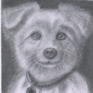
Studio Community 6 months agoModule 5 Assignment. 41 of 62 . Forward for your kind assessment.
-
Mooi hoor maar mis een beetje contrast hier en daar 😅
1 -
Hi Ashok
I think the proportions of your drawing are very good. The contrast is pretty weak. It seems like it is all the same shade. Try stretching your values and it will really make your drawing stand out.
A good exercise would be to take a good picture of your drawing now, and then go back and add dark shading and bright highlights. You can…
1 -
Ashok, Larry is absolutely right 👍
Your proportions are very good, and that’s a strong foundation. But right now most of your values are sitting in a similar range, which is why the drawing feels a bit flat.
Try to push your darkest darks more, especially in the areas where fruits overlap and inside the bowl. At the same time, protect your… Read more
3 -
Yes great proportions and nice smooth shading. Keep it up.
-
wow that is amazing
- View 1 reply
-
-

Filippo posted an update in the group
Studio Community 6 months agoSalve a tutti questo è un mio disegno da auto didatta,sto seguendo il corso da poco per avere piu conoscenze.Mi piacerebbe avere un vostro parere su questo disegno grazie.
View more comments-
Whow Super 👍🏼
1 -

Beautiful!
1 -
Grazie
1 -
This is good work
1 -
Hi Filippo
I think your drawing is excellent. The only suggestion I would have is to make the highlights just a little bit brighter. That is just one man’s opinion. This is a great drawing.
- View more comments
-
- Load More