


Studio Community
Welcome to AHR Studios Community.
Group Rules: Please do not post random text, unrelated content,... View more
Organizer:
- Organized by
-
-
Group Feed
-

Dafa Muhammad novarayana posted an update in the group
 Studio Community 6 months ago
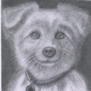
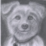
Charcoal painting when I was 14 years old My current IG name is: zero_xyra

 Andreea, Ihor and 11 others5 Comments
-

You really brought the evil out with the eyes and smile. Great job on the expression as well as the clothing.
- View 1 reply
-

wow
1 -

must have taken ages really good
- View 1 reply
-
-
Ekua posted an update in the group
Studio Community 6 months agoKettle and cherries
Hi everybody! 👋 so I’ve been working on this class for a while and have enjoyed it SO much… as well as seeing the amazing artwork here… thank you, Ali! You’ve really inspired me to keep trying to push through challenges. Here are a couple of the assignments I finished (whew)! Does anyone have any suggestions? Right now I’m struggling…
-

Very well done Ekua. Just keep on keepen on. As you continue on with the exercises, Ali explains how and shows you how to deal with contrasts, shading and realistic details. It is an awesome and rewarding experience.
I personally find it very beneficial to do an exercise a second time if I am not satisfied with my first result. My second…
2- View 1 reply
-

Hi Ekua 😊 welcome to the community
Really nice work here. The kettle looks smooth and your cherries have good form 🙌 You’re right about contrast. Try pushing your darkest areas a bit more. That will make everything pop instantly
Also watch edges. Keep some sharper where the form changes quickly. And yes, the leaf is slightly dark. You can lift… Read more2- View 1 reply
-
Love these, blending is smooth. 👍
1- View 1 reply
-
superb
1- View 1 reply
-
loved the blending,
1- View 1 reply
-
-
Ashok posted an update in the group
Studio Community 6 months agoAssignment No. 38 Glass Texture
I Trust I did a good job in this one, I found it to be very easy, until my superior look at it. Please be tough on me.(LOL)
-
Hi Ashok
This looks really good. I think if you examine the swirls on the face of the reference glass ball you will find it to be a little more pronounced. Don’t be shy about increasing your pencil values. The contrast between the light and dark values really give life to an otherwise lifeless drawing.👍👍
1 -
Hi Ashok 😊
Nice work, the form reads well and the transparency is coming through.
Since you asked for tough feedback, here it is. Your values are a bit even, push darker areas inside the glass and under the contact point to add depth. Also sharpen the main highlight edge so it feels more crisp.
You’ve got the idea right, just needs stronger… Read more1- View 1 reply
-
I think it looks beautiful and really good
2 -
Nice work. Looking like you’ll be really great soon.
- View 1 reply
-
-
SpookyStxtic posted an update in the group
Studio Community 6 months agoWhat do i need to fix?
View more comments-
I would need to see it finished first but probably the highlights
1 -
I Leave that on Ali and Larry, I’m too premature to criticize that. First Class.
 2
-
Hi Spooky
Your proportions look very good. I would suggest you go back to your reference drawing and examine the strong pencil values displayed. Listen to every word Ali says in the tutorial, and try co copy every pencil stroke he makes. It is all there, you just have to listen closely and watch intently . Happy drawing!😊
4 -
Hi Spooky 😊
Good question, you’ve got a nice base here and proportions look solid.
Main things to fix:
First, values. Your darks are not deep enough yet. Push the darker areas more, especially around the eye, nose shadow, and under the lips. Second, transitions. Some areas look patchy. Try smoother blending so the skin feels softer.
Third,… Read more2- View 2 replies
-
Add more dark values i would say
1 - View more comments
-
-
Ashok posted an update in the group
Studio Community 6 months agoAssignment No. 39
I’ve gave my best shot, Kindly give opinion.
-
Hi Ashok
That looks pretty good but my guess is that if you drew the same exercise again it would become a little more refined. Practice, practice, practice.👍
1- View 1 reply
-
Ja het klopt wat Larry zegt maar ondertussen ziet deze er ook goed uit👊🏼
1 -
Hi Ashok 😊
Nice work, the form and reflection are coming through well.
Try smoothing your shading and pushing the darks a bit more 👍1- View 1 reply
-
-
Martin posted an update in the group
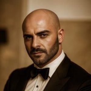
Studio Community 6 months agoI tried to go darker, but no matter how many times I go over the paper with my charcoal pencil, it just doesn’t work. When I go over the black with my brush, it actually gets lighter… I need to try a different technique. Do you have any ideas?
View more comments-
Dear Martin, I am also a new student, I has similar experience, what I did with the blending is, go extremely light and slow gradually increase pressure ,covering small areas at a time, see if that will help.
1- View 1 reply
-
Hi Martin, that is looking pretty good. You might try using graphite powder on the back ground and on the face itself.
The “Elderly Old Man” exercise shows great ways to use graphite powder. I used 8B powder and it really worked good. Ali shows several ways to use the graphite powder through out the whole exercise, and they all worked wonderfully.
1- View 2 replies
-
Hoi Martin, wat voor papier gebruik je? Hoe gladder je papier is hoe donkerder je het kunt maken en idd het wordt veel zwarter als je grafiet poeder gebruikt ipv gewoon potlood!
Verder ziet het er eng maar góed uit 😅
1- View 1 reply
-
keep it up looks like you going in the right direction although i am pretty new to this not at that point yet
🙂
1- View 2 replies
-
Hi Martin 😊
I see the issue. Your paper is getting saturated, so adding more charcoal won’t go darker.
Try this. Build your darks in layers, but stop blending too much with the brush. The brush lifts graphite and charcoal, which is why it looks lighter.
Instead, press slightly more in the final layers and use a sharper pencil for deeper… Read more1- View 1 reply
- View more comments
-
-
Ashok posted an update in the group
Studio Community 6 months agoAssignment No. 37
I’ve tried the Electric Erase, It works, but I need a lot of Practice to keep it under control. its a bit stubborn.
View more comments-
That looks great Ashok. The Mono Zero eraser is also a really versatile tool. It takes a little practice to figure out what it will and won’t do.
My first dealing with the Mono Zero were not very successful. I started practicing by laying down various base coats on regular drawing paper,using different graphite pencils. Some with multiple layers…
4- View 1 reply
-
wow
2 -
Looks great if this is your first attempt. I too struggle with electric and mono zero.
2 -
super
1 -
looks great .
what brushes do you use for blending if you dont mind me asking ?
1- View 2 replies
- View more comments
-
-
Ashok posted an update in the group
Studio Community 6 months agoThis is a very Challenging one ,with a bit of patience and Persistence I’ve got this far.my Dear Colleagues please give your critic.
View more comments-
Good job Ashok, it looks complex.
1 -
very nice
1 -
Hi Ashok
Well done. This is a great exercise.
1 -
Ja hoor dit ziet er goed uit!👍🏼
1 -
wow
2 - View more comments
-
-
anthony posted an update in the group
Studio Community 6 months agometal drawing done, think i might attempt the lantern next to see how that comes out before i try my 2nd attempt at a pastel drawing
-
Ziet er goed uit Anthony👍🏼
2 -
Well done Tony
2 -
Great job
2 -
Hi Anthony 😊
Nice work on the metal study, the reflections are coming through well.
Going for the lantern next is a great idea, it will really level up your understanding of materials.
Keep pushing your darks a bit more for stronger contrast
Looking forward to your next piece 👍2 -

🤩
1
-
-
Alejandro 🜲 posted an update in the group
Studio Community 6 months agoLesson 22 One-Point Perspective
After not being able to do lessons for several weeks, I am back. Here is my progress for this lesson. I hope to be able to complete lessons more frequently 🙏🏻
View more comments-
Deze is heel sterk Alejandro!
2- View 1 reply
-
Very well done Alejandro. Nice and crisp with good vanishing point.
2- View 1 reply
-
amazing
2- View 1 reply
-
Looks awesome. Keep it up
2- View 1 reply
-
picture shows your sincerity, discipline and respect on drawing.keep going 👍
2- View 1 reply
- View more comments
-
- Load More
