
Studio Community
Welcome to AHR Studios Community.
Group Rules: Please do not post random text, unrelated content,... View more
Organizer:
- Organized by
-
-
Group Feed
-
Frederic 🜲 posted an update in the group
 Studio Community 3 months ago
My avocado drawing.
Here is my avocado drawing! I’m off angle, and as a result, I got stuck with the cast shadow. Maybe I was a little lazy as well. I also didn’t render the background avocado as well as I could have, and I missed a few details.Overall, I’m not sure if it comes close enough to the reference, but every drawing is another learning experience and a…

 Anim, Marlon and 14 others8 CommentsView more comments
-

Hi Frederic
First of all, I hope you have a fast recovery from your back surgery. Your avocados really looks close to the reference. My guess is that if you drew it again it would be perfect.😊
1 -

It looks pretty close to the reference. I think adding the shadows will make it even better.
Hope your surgery goes well, I’m going to miss your drawings…
2 -
I think you’re being a bit too hard on yourself. The avocado looks very convincing, especially the texture of the skin and the subtle color transitions. The seed also has a beautiful, natural shine. Yes, there are always little things we’d improve if we started over, but that’s true of every drawing. I think you did a great job. Well done!
1 -

very good a reference is what it is a reference who said it has to be the same and i also think if you put some shadow in would be floorless oh and good luck with surgery hope all goes well
1 -

Looks pretty convincing to me. Best wishes and a quick recovery from your back surgery.
- View more comments
-
-
Krish posted an update in the group
Studio Community 3 months agoGuess the actress...
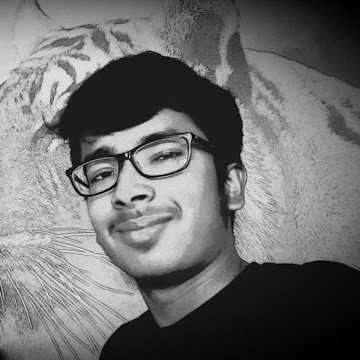
Tell me how i have done and apart from eyes which i know i messed up , what areas should i improve upon
View more comments-
I don’t know this actress but looks nice!
-
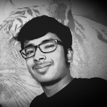
Is this in any way looking like emma watson ?
1 -
Hi Krish, welcome to AHR Studio Community. Your drawing has very strong qualities. You will learn a lot from the Studio tutorials. Ali has provided several excellent portrait tutorials that you might like.👍
-

Hi Krish, welcome to the AHR Studios community! 😊 It’s great to have you here. You’ve done a really good job overall! The portrait has a nice likeness, and I especially like the hair, eyebrows, and smile.
Since you asked for feedback, besides the eyes, I would focus on refining the proportions of the nose and mouth a little more, and add…
1 -

@5791-krish IMHO a nice portrait. Welcome. But I’m stuck geussing the actress. I’m not a great movie fan so……..can you tell ? But overall I like it very much. 👏
1 - View more comments
-
-

Anthony posted an update in the group
Studio Community 3 months agoProject #2
2nd piece after rediscovering my long lost passion for drawing through this community! 11×14 done in charcoal.
View more comments-
Well done Anthony.
1 -
Anthony, wow… this is incredible! The eyes have so much life, and the water droplets look fantastic. You captured the mood of the portrait beautifully, and the overall contrast gives it a lot of impact. If I could suggest one small thing, I’d just soften a few of the skin transitions around the cheeks and chin. That will make the face… Read more
2- View 1 reply
-
This is only your second piece? That’s seriously impressive! I can’t wait to see your next project!
1- View 1 reply
-
nice great job
1 -

I love it!
1 - View more comments
-
-

Cheryl 🜲 posted an update in the group
Studio Community 3 months agoFried egg
Testing my new polychromos and toned tan paper. Great pencils. I followed the tutorial but not sure if I picked the right colors, some of them look a bit off. The proportion is also a bit off (compared to the reference image).
-
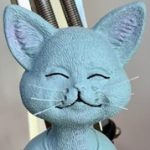
All broken eggs are not created equal
1 -
Cheryl, this looks really good! I actually think the colors work very well on the toned paper, and the egg already looks quite realistic. The yolk has a nice smooth transition, and the crispy edges are looking great. I wouldn’t worry too much about matching every color perfectly. As you practice more, choosing the right color combinations… Read more
2 -
@cheryl has always a nice drawing. You’re right about the color choice. Maybe some more contrast would have been better. About the proportions I don’t know. They all look different, so it’s your own interpretation. I think we should some time let go the fact that we really stick to the reference photo. I learned it from sketching. I will give it… Read more
1- View 1 reply
-
I think you’ve done a great job with this. The egg already looks very appetizing, and I especially like the soft transitions in the egg white and the glossy highlight on the yolk.
1
-
-
Martin posted an update in the group
Studio Community 3 months agoDragonfly Missed
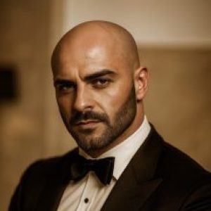
I don’t really like this drawing because I wasn’t sure how to draw the dragonfly so that it would look realistic. It would have needed a lot more fine details, but I wasn’t exactly sure how to add them. How would you have drawn something like this?
Best regards,
-
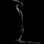
Hi Martin, I usually use a reference image, better digital for zooming in purpose, and I study shades and gradients each part at a time…. I am not very good with drawing from imagination!!!
2- View 2 replies
-
Martin, first of all, don’t be too hard on yourself. I actually think you’ve done a great job overall. Looking at the reference, the dragonfly itself doesn’t need a lot more detail. The biggest difference is actually the contrast. In the reference, the dragonfly is much darker in certain areas, which helps separate the body and wings from… Read more
2- View 2 replies
-
-
Cheryl 🜲 posted an update in the group
Studio Community 3 months ago3 months ago (edited)
Light Bulb
got some gray craft paper (125gsm) to try on. Not sure what the white pencil is in this tutorial (https://academy.ahrstudios.com/realtime-tutorials/dc1/) . It looks like chalk but I was having trouble layering chalk on graphite, so I’m not sure.
I was having issue doing the outline without grid so decided to use grid.
-
Well Done !!
1 -
very good Taylor
-
@cheryl This is very impressive. Very good shadows, nice glass and socket looks really metallic. I’m impressed. On grey craft paper was probably a challenge. I used a gelly roll pen on some areas’s on mine. BTW got the LANGUO erasers and they work very good. Thanks again for the tip. 👏
1- View 1 reply
-
Cheryl, this looks beautiful! 😊 The transparency of the glass is excellent, and you’ve done a great job capturing the subtle reflections. The white pencil used in the tutorial is **Pitt Pastel**. It works very well over graphite for those bright highlights.
I also think using the grid was a good decision if it helped you get the outline… Read more
1 -
Very well done
1
-
-
Frederic 🜲 posted an update in the group
Studio Community 3 months agoFinnaly The lantern Drawing
I finally finished the lantern drawing! It has been one of the most challenging drawings I’ve tackled so far, alongside the colored pencil avocado. I’m really glad it’s finished.
I don’t know if I should be proud of the final result, but I do know that I don’t want to start over again. 😄
More importantly, I learned a lot throughout the process,…
View more comments-

It turned out just like real metal; the texture looks great 🙏😊
1 -
this looks perfect. Now i’m not sure if I want to do this (yet) 😂
2 -

what can i say mate, you absolutely nailed it.
1 -

It looks absolutely STUNNING! So impressive!
2 -
it turns out really amazing😍
1 - View more comments
-
-
Martin posted an update in the group
Studio Community 3 months agoLove with one eye
-
These surrealist works are very inspiring; I love them. Congratulations 👏🏻👏🏻🤩
- View 1 reply
-
Now that’s what I call an eye catching drawing! 👏 very well-doneeeeeeee!
 2
- View 1 reply
-

Really funny, I like it.
1- View 1 reply
-
I absolutely love this concept. It’s so creative and surreal, yet it still feels elegant rather than shocking. The composition immediately grabs your attention, and that single eye becomes an incredibly powerful focal point. The smooth shading on the face contrasts beautifully with the torn opening around the eye, making the illusion even… Read more
1- View 1 reply
-
-
Akanksha posted an update in the group
Studio Community 3 months agoKrishna
I tried drawing Krishna after understanding the basics of shading. Visually, I’m really happy with how it turned out, but I know there’s still a lot to improve. I’ll keep learning, practicing, and getting better with every session. 💙✨
-
Beautiful work, Akanksha! 😊 Your shading has come a long way, and Krishna’s eyes are especially full of life. Keep practicing like this, and your confidence will grow with every drawing. Wonderful progress!
- View 1 reply
-
Its a beautiful drawing.
1- View 1 reply
-
I liked it a lot.
1- View 1 reply
-
-
Akanksha posted an update in the group
Studio Community 3 months agoToday’s practice. ✍️
I know it’s not my best, and there’s still a lot to improve. But every session is helping me learn something new. I’ll keep practicing and improving step by step as I move forward.
-
This is exactly how real progress looks, Akanksha! 😊
1- View 1 reply
-
Keep it up!
1
-
- Load More